This is the design component of a two-part project to improve the information architecture of the Activities shopping path on Expedia:
At Expedia, I redesigned the information architecture of the Activities shopping path, including the search results page and activity information page, using mixed-methods research to inform my design. This was a self-intiated project, which I conducted over several months in my "extra" time at work. I designed and conducted a research program to inform my work, consisting of ethnographic interviews, competitive analysis, and a Kano study, as well as usability studies of prototypes along the way.
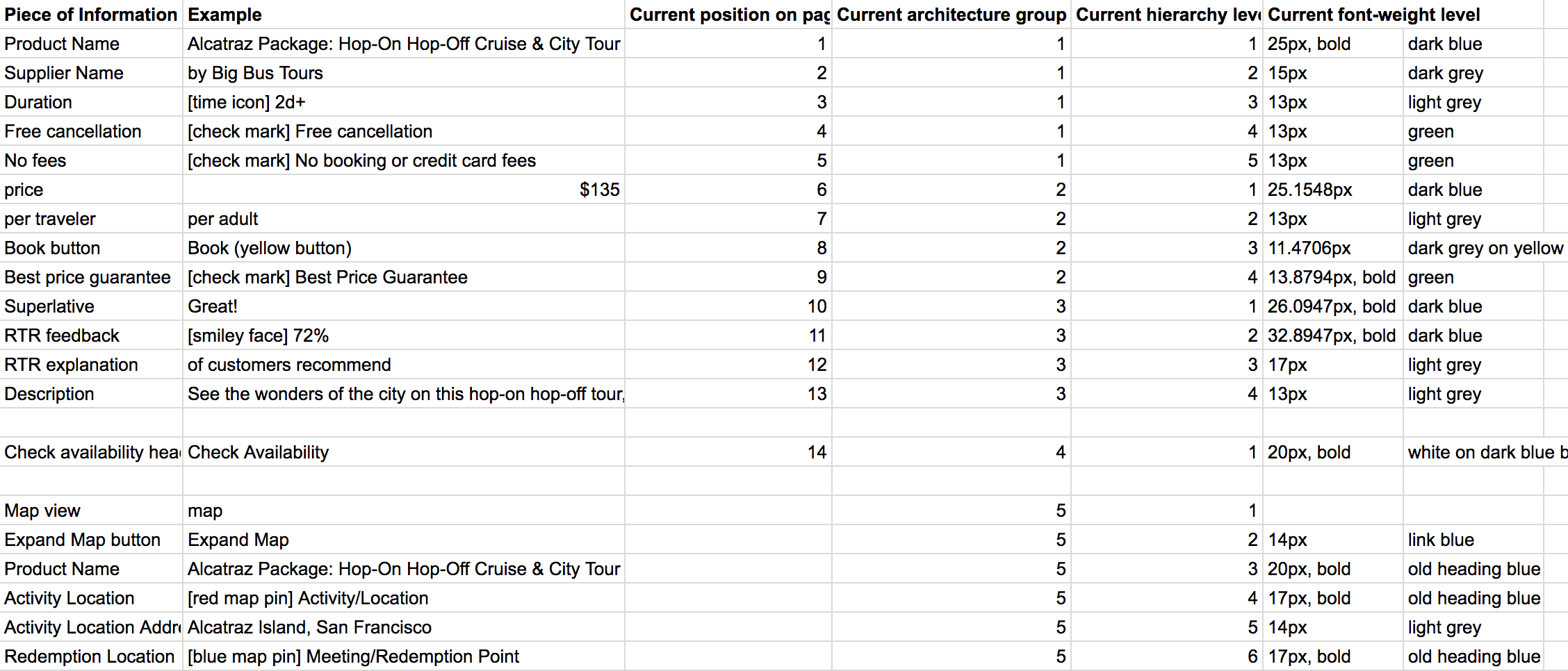
First, I analyzed the existing information architecture of Expedia's Activities search results page and activity information pages to document the current state and find any major issues.
Next, I conducted unstructured interviews with eleven people who were planning a trip in the next 3 months. These interviews included a trip planning activity where the participant would look for and go through the booking process for a thing to do on their upcoming trip. The purpose of this activity was to see how they went about finding something to do, what information was important to them at what point in the process, and what sources they went to. I then spent some time deconstructing their information seeking behavior to look for patterns and reasons for why they were looking for the information they were looking for.
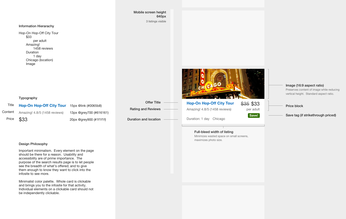
Some explorations of restructuring the Activities search result listing before I had conducted the research:
After our intial research, I began exploring different ways to restructure the information on the page. Based on both the qualitative study and the Kano survey, I ordered information by its importance to the user, and grouped related information.
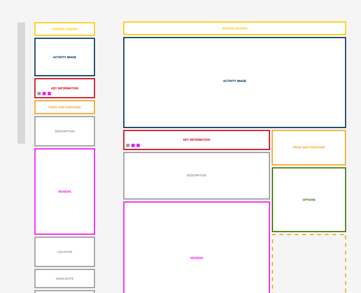
I created an information architecture wireframe system to show different "chunks" of information and how they can be structured on the page. This made it easy to quickly reorder and play around with different structures.
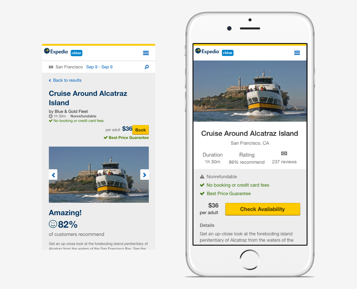
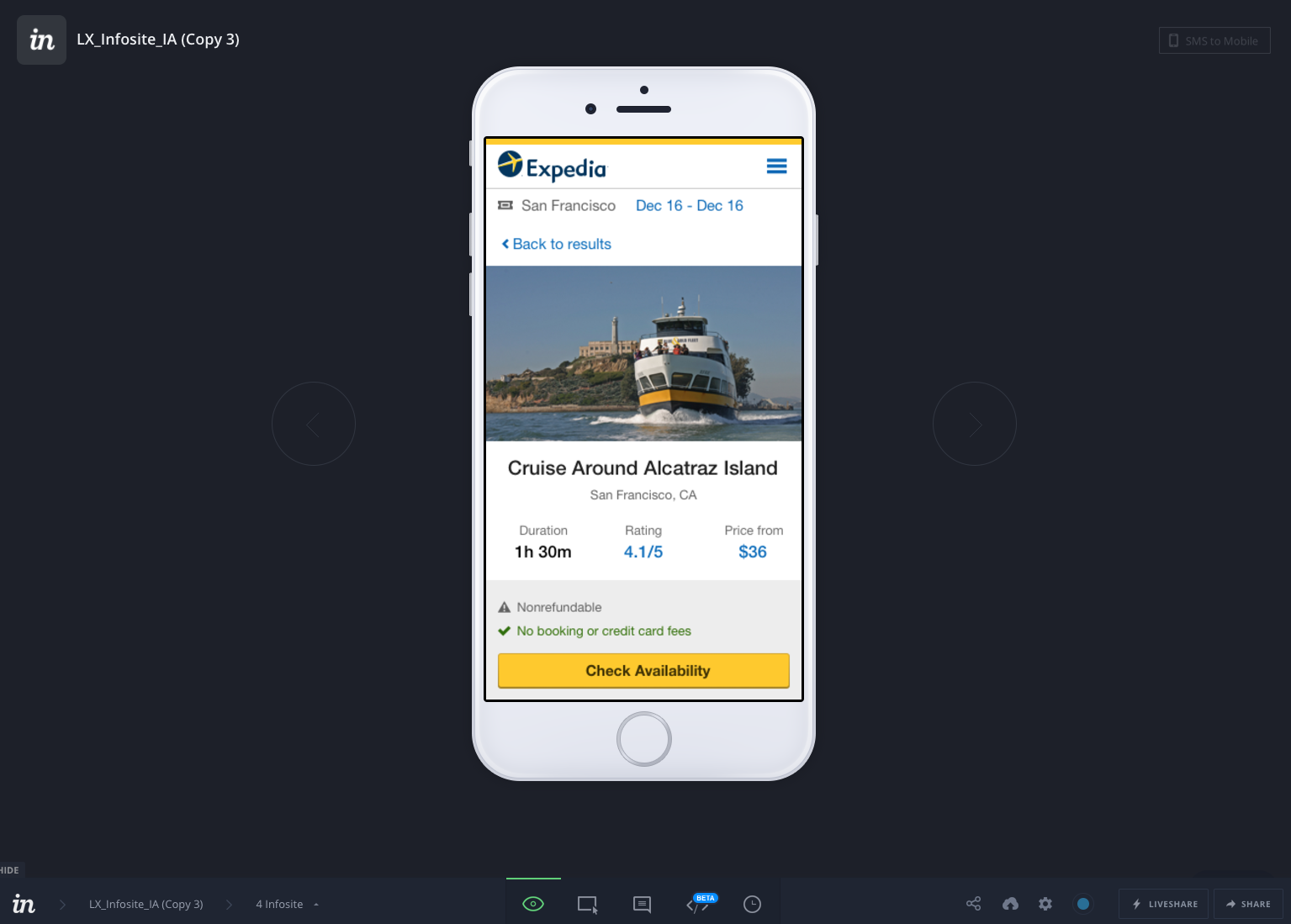
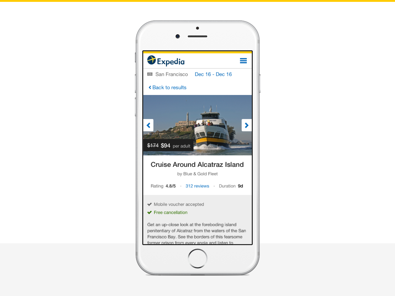
Once I had a couple structures I thought were promising, I began to make more high fidelity mockups putting in real information on the page. On the left is the current Activities detail page, and on the right is one of my explorations.
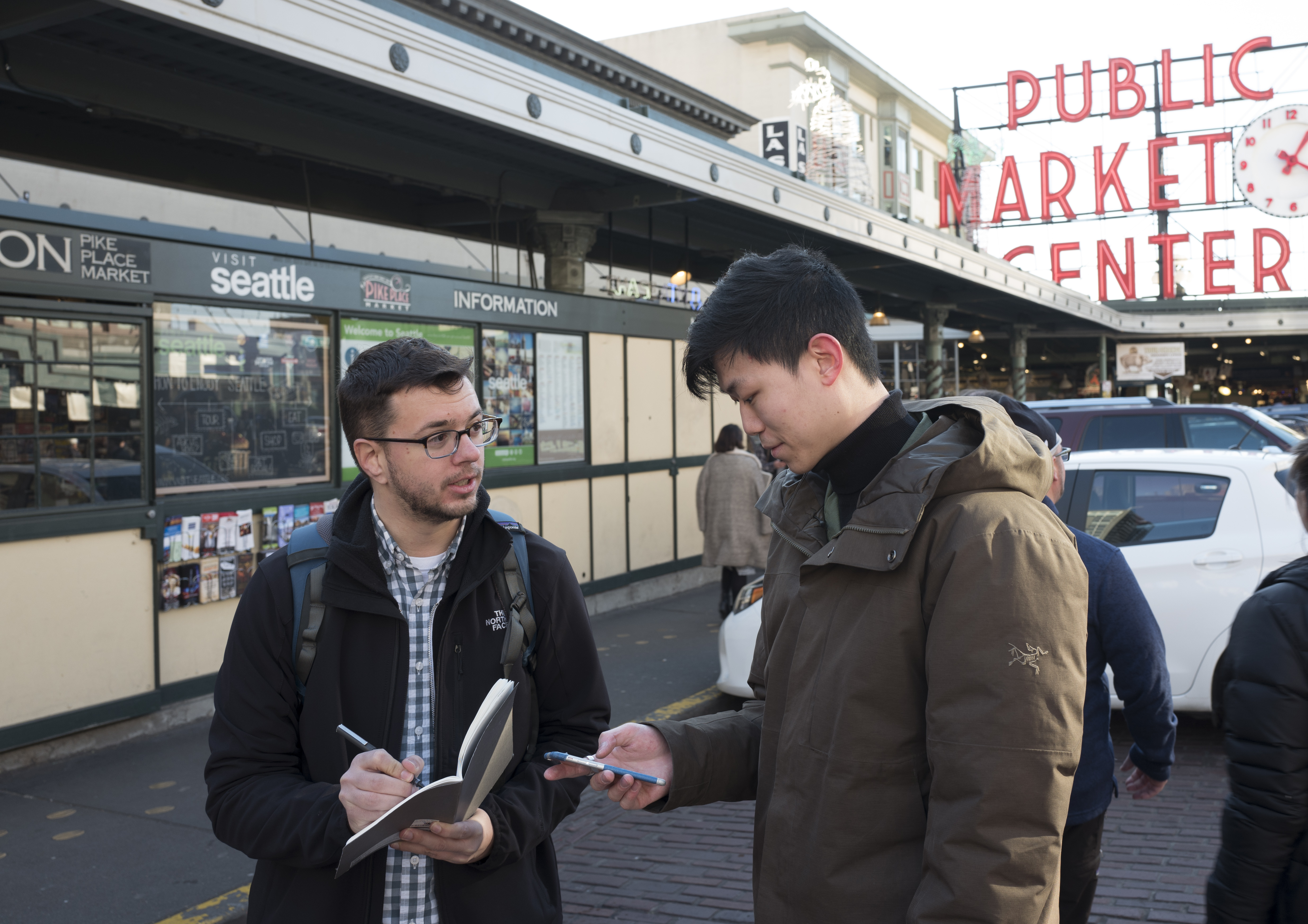
After some further iterations, I created an InVision prototype, and went to Pike Place Market to do a quick and dirty usability study.
Seattle's iconic Pike Place Market offered the perfect location to do an intercept study for an activities travel experience. Most of the people there during the day are tourists, so it is easy to find people who are on a trip, for whom searching for and planning travel is on the top of their mind.
Following the usability study, changes were made to the interface to address problems that came up, while retaining the key design features of keeping large, immersive imagery, and the high level filter information (rating, duration, and price) prominently featured near the top.
Through mixed-methods research, I designed and evaluated a new information architecture and visual design for Expedia's Activities shopping path. I pitched this new concept to leadership and they decided to move it into development. Currently I am working with our developers to implement this new design.
Through this project I gained more experience with designing a mixed methods research study, and how to take away actionable findings which can be used to inform design. I also improved my visual design skills, especially related to how to use visual design to respresent an information hierarchy. I also became very good at influencing product in a large corporation, and how to use research to demonstrate why one design concept is better than another.