This is one part of a multi-phase project to redesign the filter pattern UX for activities on Expedia:
For some time, Expedia has been working on a new, more complex way of categorizing the activities that we sell. This new categorization will introduce a two-level system; categories and subcategories. As a result, we needed to figure out a way to expose this to our users to enable them to better be able to filter and find activities that are interesting to them.
This was a multi-phase project, where I first explored the design space, then created a functional web prototype, and then conducted an evaluative user research study to determine which was the best design concept to go with. After that, I worked with another designer to iterate and refine that concept into the production design.
I began by thinking about the user journey for activity shoppers to see where filter use fits in. Referring back to an internal tool we use, our "User Journey Map" for activities, I decided to focus on the point where users "decide on some activities or activity types." The key pain points at this point are that it is difficult to know where to start, users are overwhelmed with choice, and there are so many options, that it is difficult to figure out what is the most relevant to them.
Currently, our filters consist of a list of broad categories that a user can view by clicking on a "Sort & Filter" CTA on the activities search results page.
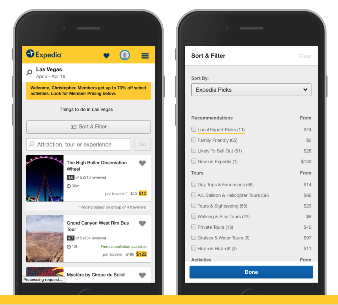
A small set of categories is used to categorize the broad range of activities we offer all around the world. User feedback has shown that these categories aren't particularly useful, because when you select a category, it often doesn't narrow down the results much, and then there is no way to narrow further without just browsing the entire list of activities.
Because of this, the Activities team has created a new set of around 20 parent level categories and close to 120 subcategories which connect back to the parent categories. This will give us a lot more power in being granular when we categorize activities.
So the question became, "how do we expose these new multi-level categories to our users?"
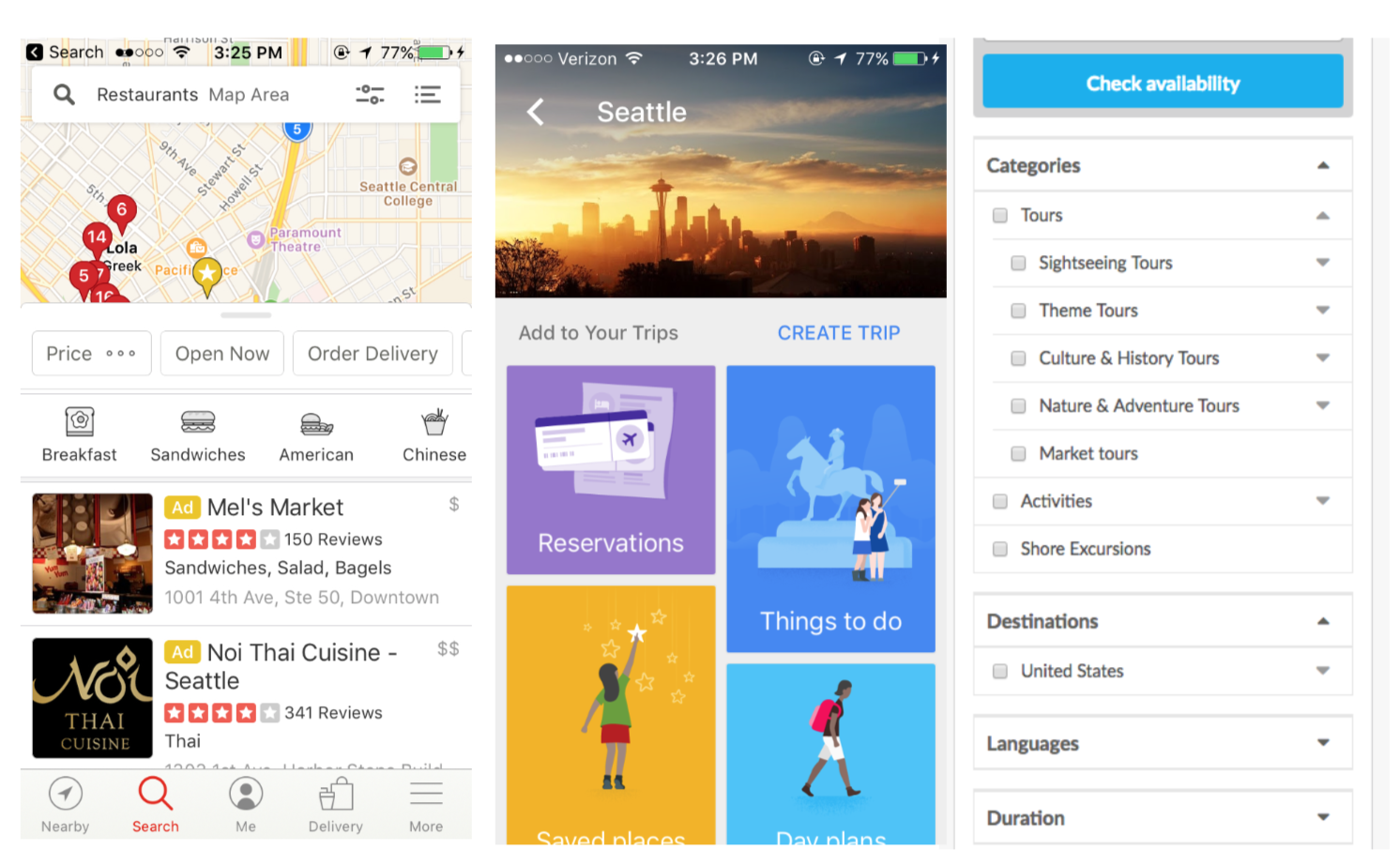
I began by doing a competitive audit of competitors and other websites and apps to see different patterns and concepts that were being used.
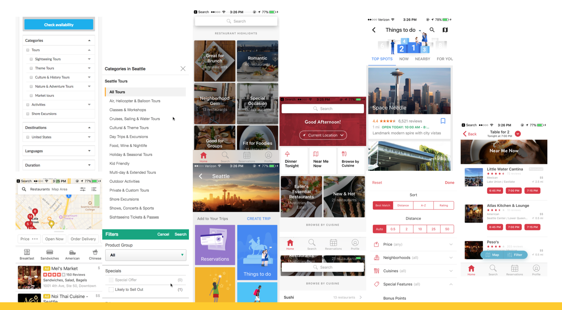
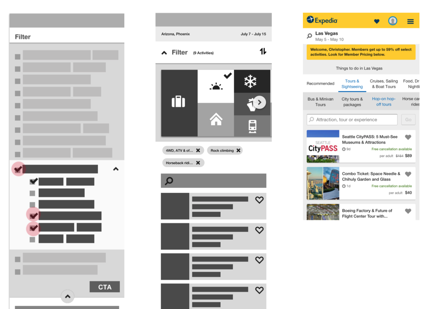
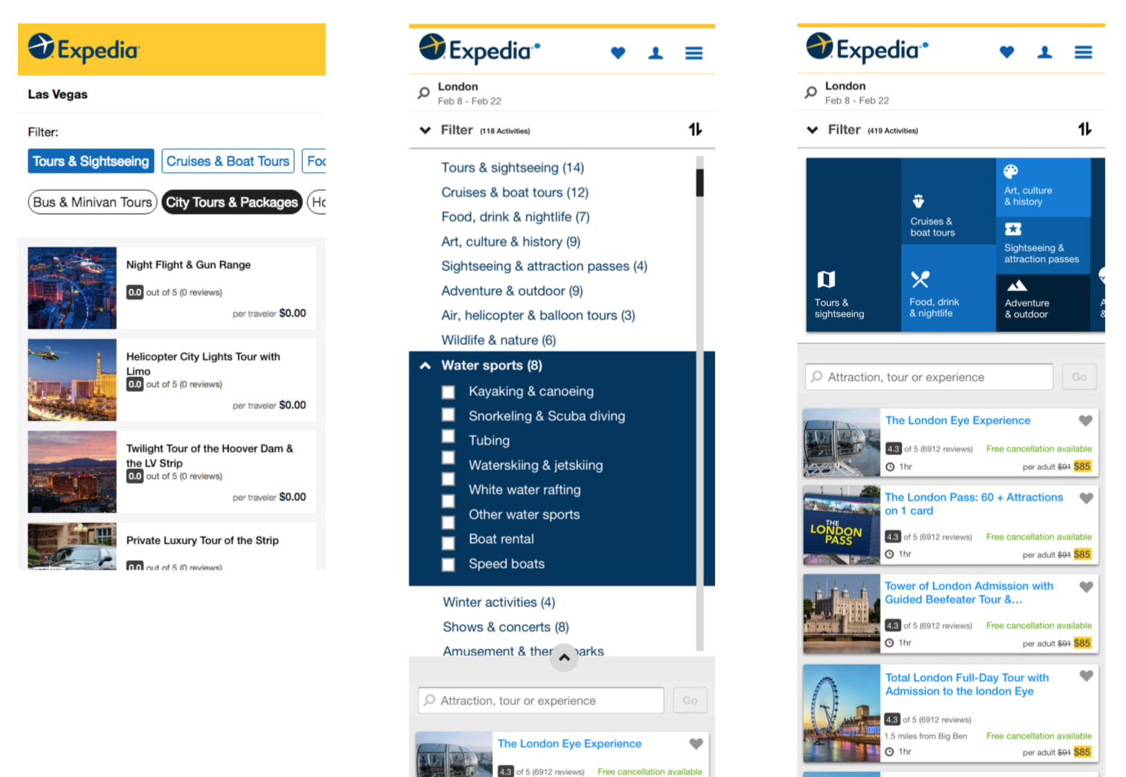
Next, I organized a user study to evaluate several of the concepts which had interesting features that I wanted to learn more about. These features were the double-layered quick filter on Yelp, the tile then tab view on Google Trips, and the large tiles with photographic backgrounds on Open Table.
In the user study, we saw that Yelp's pattern seemed to be easily understood and got a lot of engagement. Google Trips seemed easy to understand as it stepped out the possible options into multiple steps, thus reducing cognitive load on the user. We also found that while users said they liked Open Table's photos, that pattern didn't scale well as the number of categories increased, as it required a lot of scrolling to see all the options.
Therefore, I decided to focus my design explorations on three areas: a concept similar to Yelp's quick filters, a concept similar to Google Trips' stepped approach, and a concept similar to our closest competitor, Get Your Guide. Open Table was dropped due to what we saw in the user study.
I began the conceptualizing phase by sketching out different ideas with some colleagues on a white board.
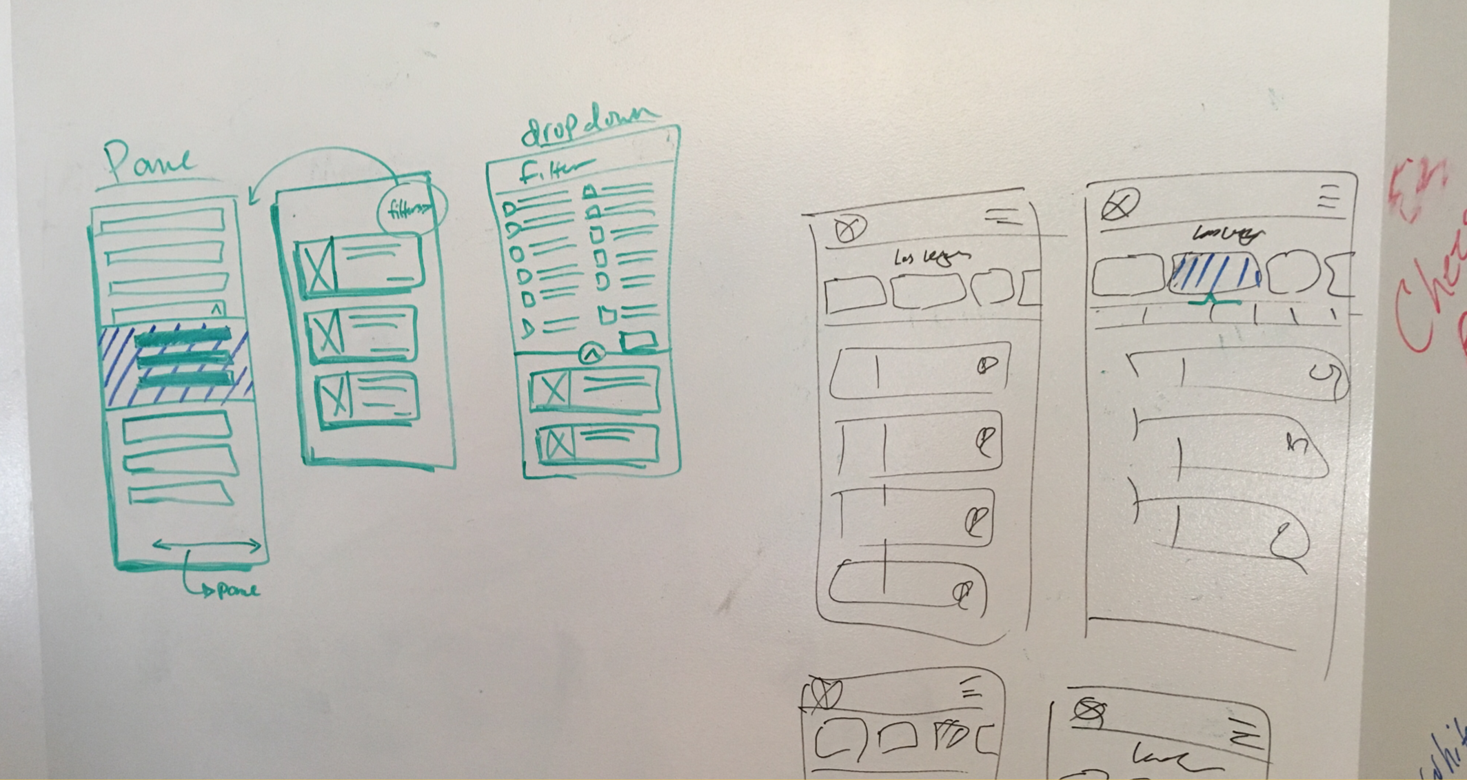
As we began to refine the concepts a bit, and narrow down on three in particular, we started making wireframes in Sketch.
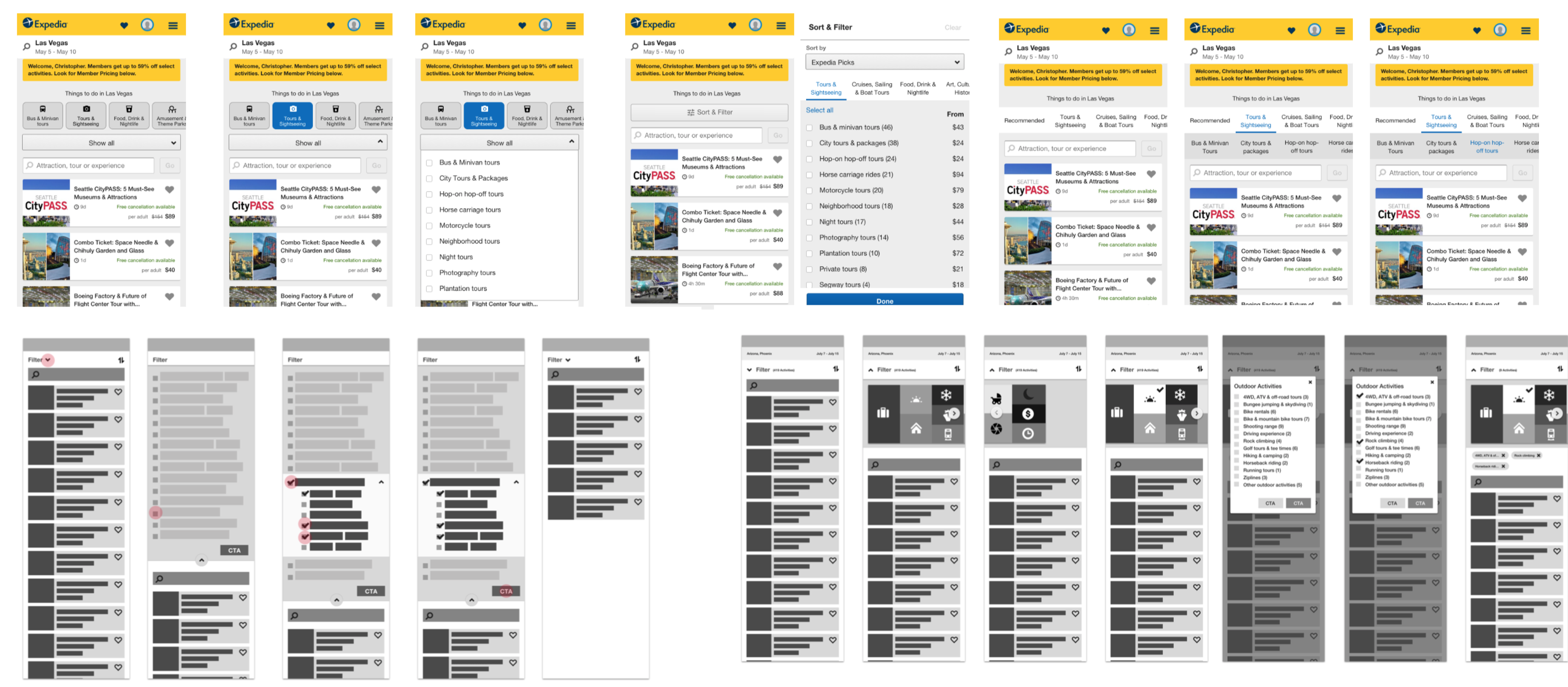
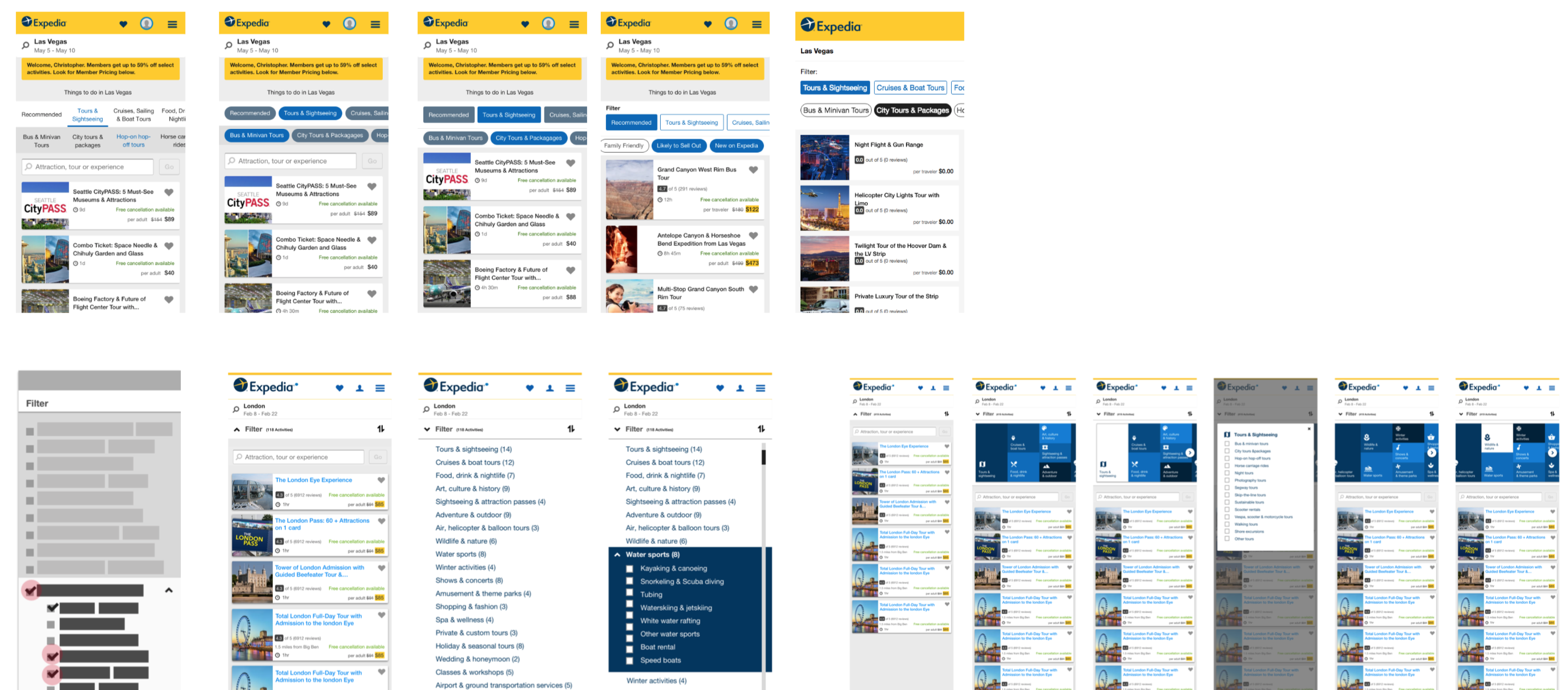
Eventually, after much exploration, we narrowed down to three main concepts. One which is very similar to Get Your Guide's, but with some changes made to improve usability, another which was inspired by the Google Trips tile interface, and a third which was inspired by Yelp's two level quick filters.
After this narrowing, we spent some time iterating on the concepts.
Eventually coming to three that we wanted to evaluate in a user study.
After further thought when planning the user study, I decided just to test the first two concepts: the Yelp-inspired one and the one most similar to our competitor. Our product team was strongly pushing us to test at least one variant similar to our competitor, so I definitely wanted to evaluate that one, and the Yelp-inspired concept seemed most different than our competitor's concept, so I thought that by evaluating those two we could learn the most in the limited time we had in a usability study.
As a result of this design process, I created two design concepts which I prototyped in order to conduct an evaluative user research study. The user study helped me decide which concept to continue to evolve in order to build as an A/B test. Because of the design process I followed, which started with considering the user problem, and involved user research at several steps, I am confident that the design I ended up with will do a good job solving the user needs, and that I will learn something from A/B testing it versus the current filter pattern.
Through this project, I got another chance to go through a whole design process, from concept to development, and was able to integrate research at several stages along the way. This gave me further experience in my career goal of working on how to best integrate user research and design in order to create the best products.