This is the research component of a two-part project to improve the booking flow of the Activities shopping path on Expedia:
In spring 2017, I worked on reimagining the booking flow for our Things to Do line of business. One aspect of the design process was conducting a usability study on a prototype of the new design. For more about the design process for this project, see Expedia Activity Booking.
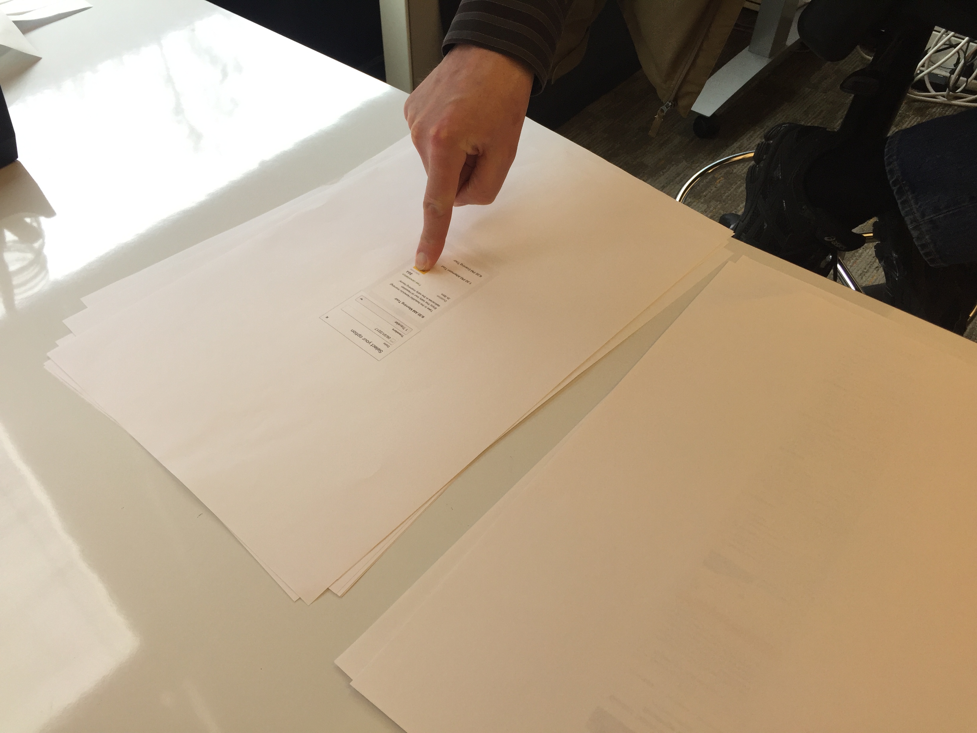
After going through an initial competitive analysis and design phase, I wanted to evaluate whether or not our flow made sense to users, and if we had all the necessary information or if we were missing something. I decided to conduct a paper prototyping study. I have found that users are more likely to offer constructive criticism to a paper prototpye than a more polished closer to production prototype, as it feels like its still fluid; a work in progress. I created a research protocol, and recruited 8 participants, screening for people who had an upcoming trip planned in the next three months.
My protocol set up a situation:
You are planning an upcoming trip to Hawaii in June. You'll be around Honolulu for fourteen days, from June 1 through June 15, 2017. You go to Expedia and click the “Things to Do” Tab, and put in your destination and dates. You’re looking for a fun activity to do on the weekend for yourself, your spouse, and your child.I was looking specifically for if users understood the flow, if there was confusion at any point, and if there was any information they were looking for at any step that I didn't have in the design. The interview questions were relatively unstructured, but I had a few key questions about each step that I asked every participant. I was also looking for any general usability issues.
After conducting the study, I analyzed my notes and observations for trends as well as whether or not there was any information that users were looking for that was not present. I found that in general, the participants understood the flow and how to book an activity, but there were some usability issues that we needed to address. For example, there was some confusion on how to close a full page takeover. There was also some confusion around the affordance we used to configure the user's travel party.
Based on these findings we made several changes to the design. First we made the close affordance for the full page takeover more prominent, changing from a small "X" link to a blue close button. Secondly, we changed the affordance for opening the traveler party menu from a link to a dropdown menu which we think will make the interaction more understandable to users. After making these changes, I conducted a quick followup study with two more participants, and found that they understood these parts of the UI much better. While this is a small number of participants, it was a quick and dirty gut check which helped us move forward with the project. When it is rolled out, it will be as an A/B test, and we will be tracking engagment with every element on the page, which will help us to see if our findings in this small quick study generalize to the larger population. I will also conduct another usability study once a live version is complete to get qualitative insight in a more realistic scenario (with live data and users being able to search for whatever they want) to augment our quantitative data.
I gained more experience designing and conducting a usability research study, especially utilizing RITE methodology where iterations can be made between sessions. I also got practice in making actionable design recommendations from usability study findings. Through this project, I also helped gain more acceptance in the design and product communities at Expedia for the need for multiple kinds of research at different stages in the design process, and the value it brings.